Payments on VTB Bank
VTB Bank is the second-largest bank in Russia with 15+ million customers. 98% for all payments made via mobile phones. Payments are a big part of user activities in VTB Bank, but the experience did not meet user expectations when I joined the bank. This case highlights some of the features I designed as an individual contributor and led designers in the Payments department, focusing on reimagining the payments experience for iOS, Android, and Web.
Timeline
2020 - 2022
Service
Strategy, Leadership, Stakeholder Communication, User research, Testing, Product design
Problem statment
The business problem is that customers choose another bank for service payments, affecting loyalty and leading them to withdraw funds.
Clients struggle to complete payments because of complex navigation or overloaded forms. 40% of payroll clients, who transfer more than 50% of their funds to another bank, cited the inconvenience of making payments as the reason for withdrawing funds.
How it was before
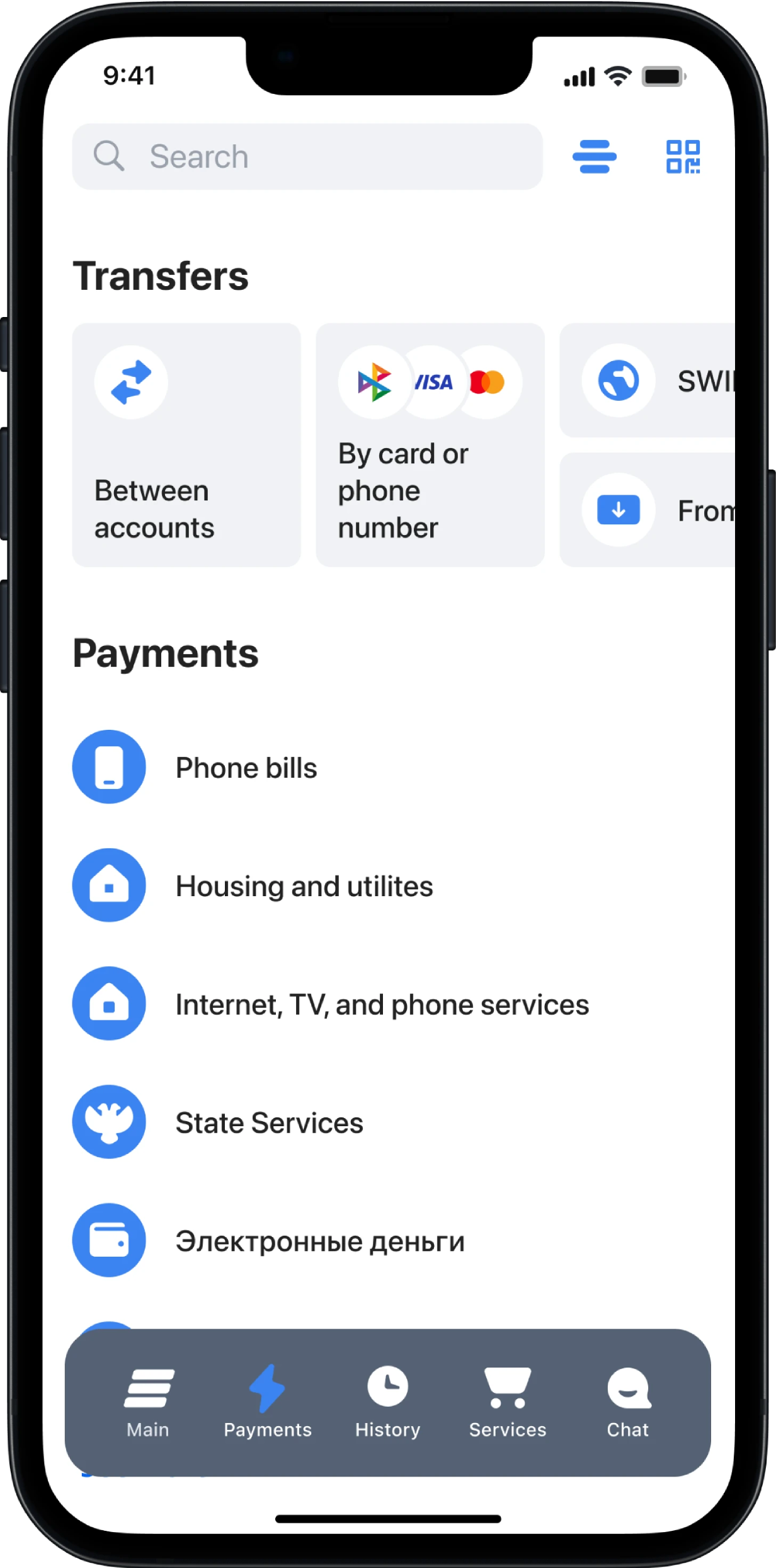
Payments screen had basic features are available. There is no quick access to templates, auto payments, and bills for payment, etc.
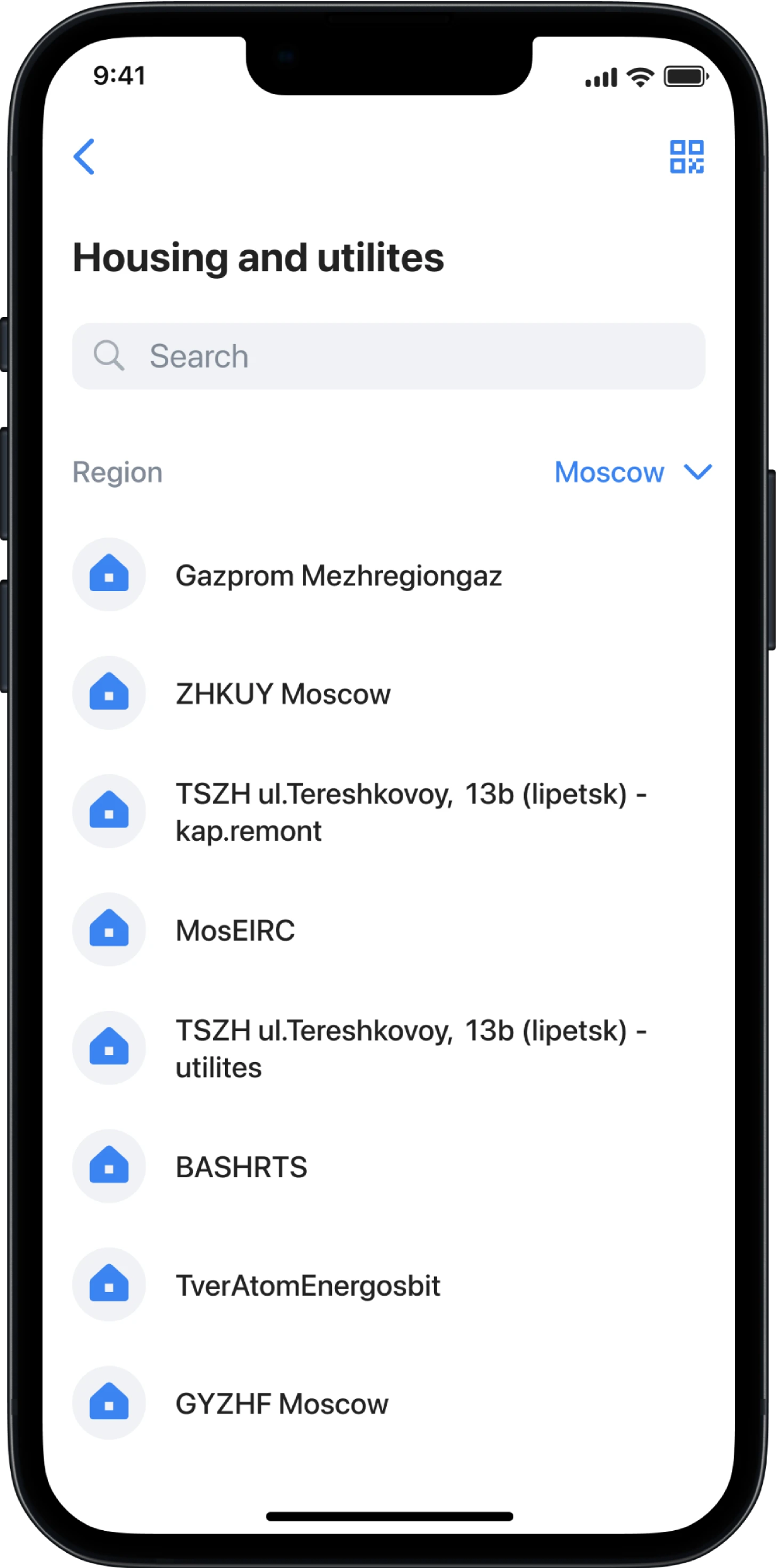
Payments screen had basic features are available. There is no quick access to templates, auto payments, and bills for payment, etc.
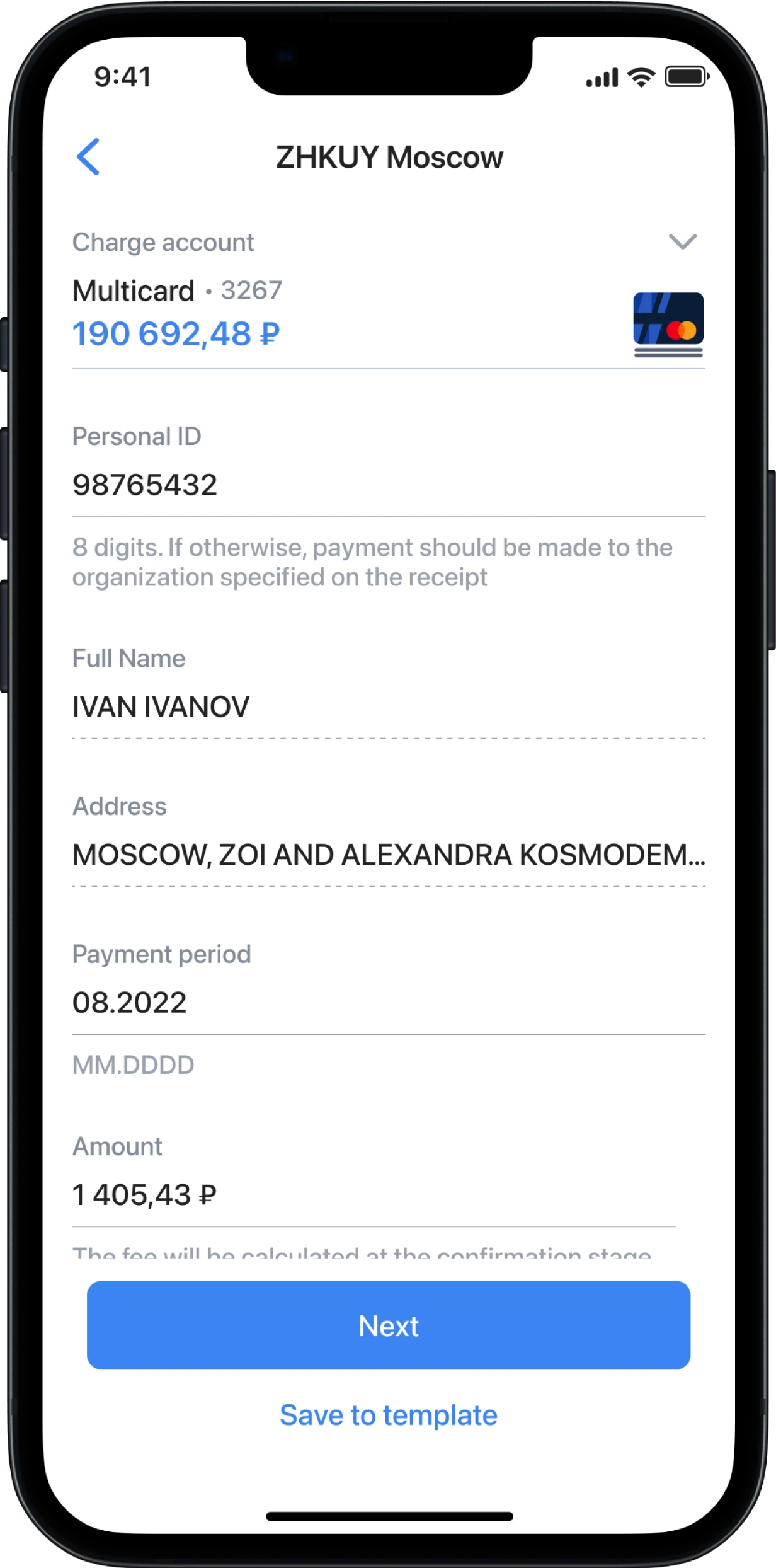
Payment forms had a large number of unnecessary fields, including fields that cannot be edited. There are many tooltips, which complicate reading the form.
How it’s going
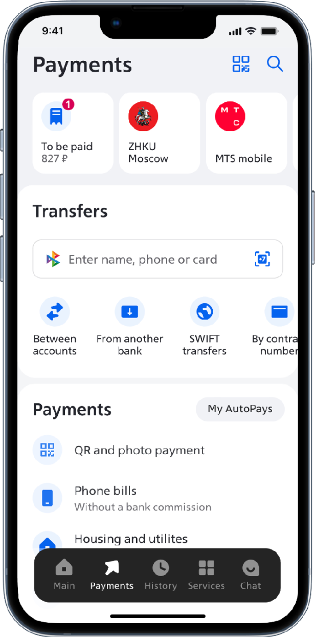
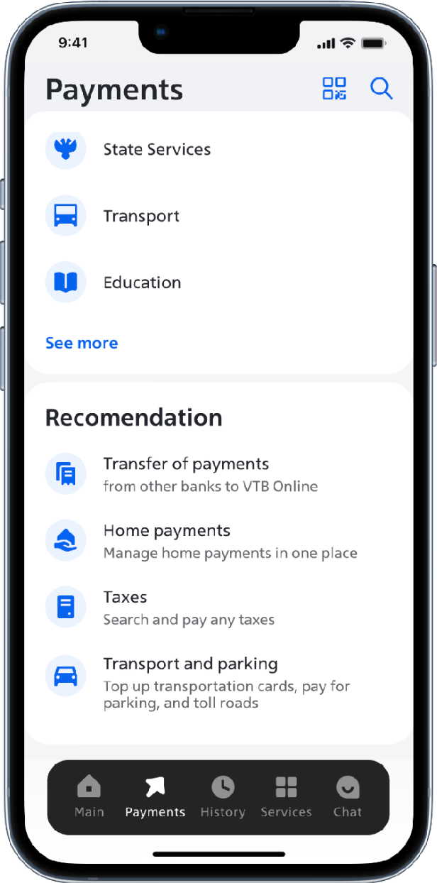
Payments screen
Quick access to templates, auto payments, bills, and transfers was added to the payment screen, along with a recommendations section for setting up recurring payments. The number of payments for template and bills doubled (x2)
Catalog and search
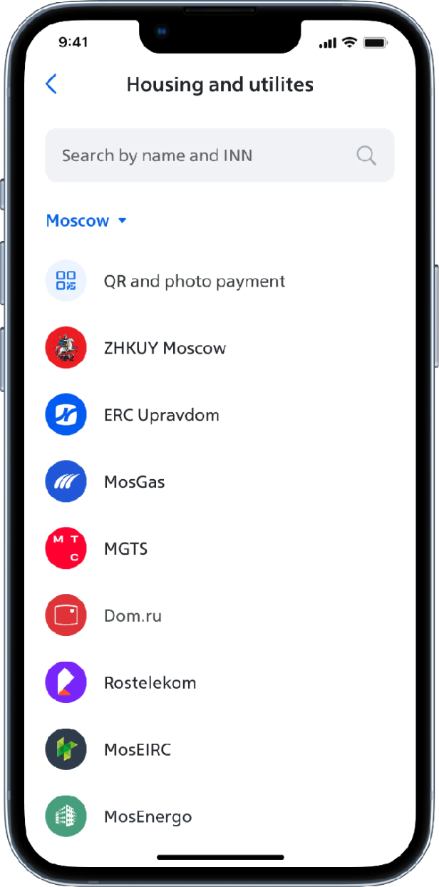
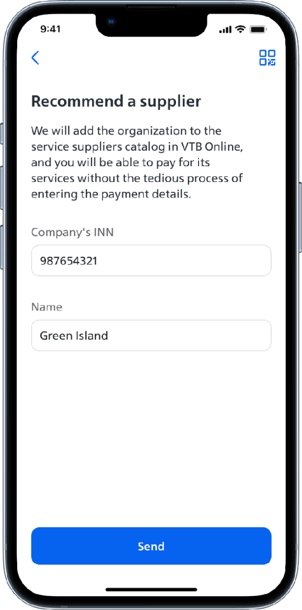
Adjusting the sorting moved 95% of popular providers into the first two viewports, increasing transitions to providers by 30%. Allowing users to recommend suppliers directly on the search results screen resulted in 170,000 requests for new companies, highlighting catalog weaknesses and helping prioritize supplier manager tasks.

Payment forms and Wizard
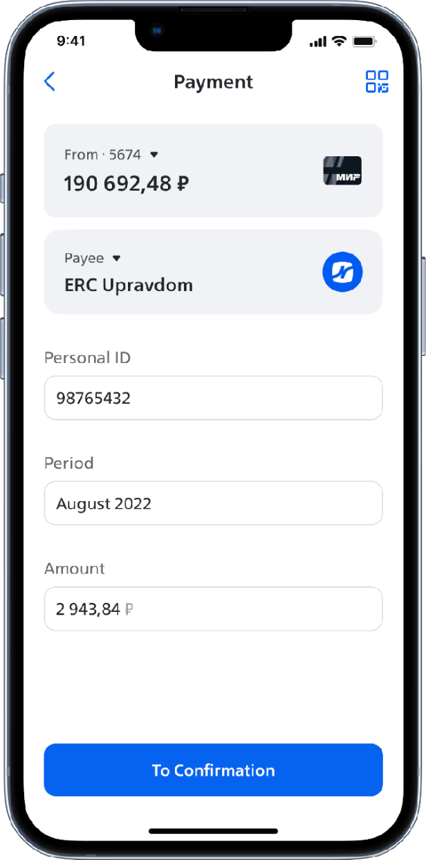
Forms received many new features: we added supplier details, wizard, and block structure. This led to fewer errors when filling out the form.
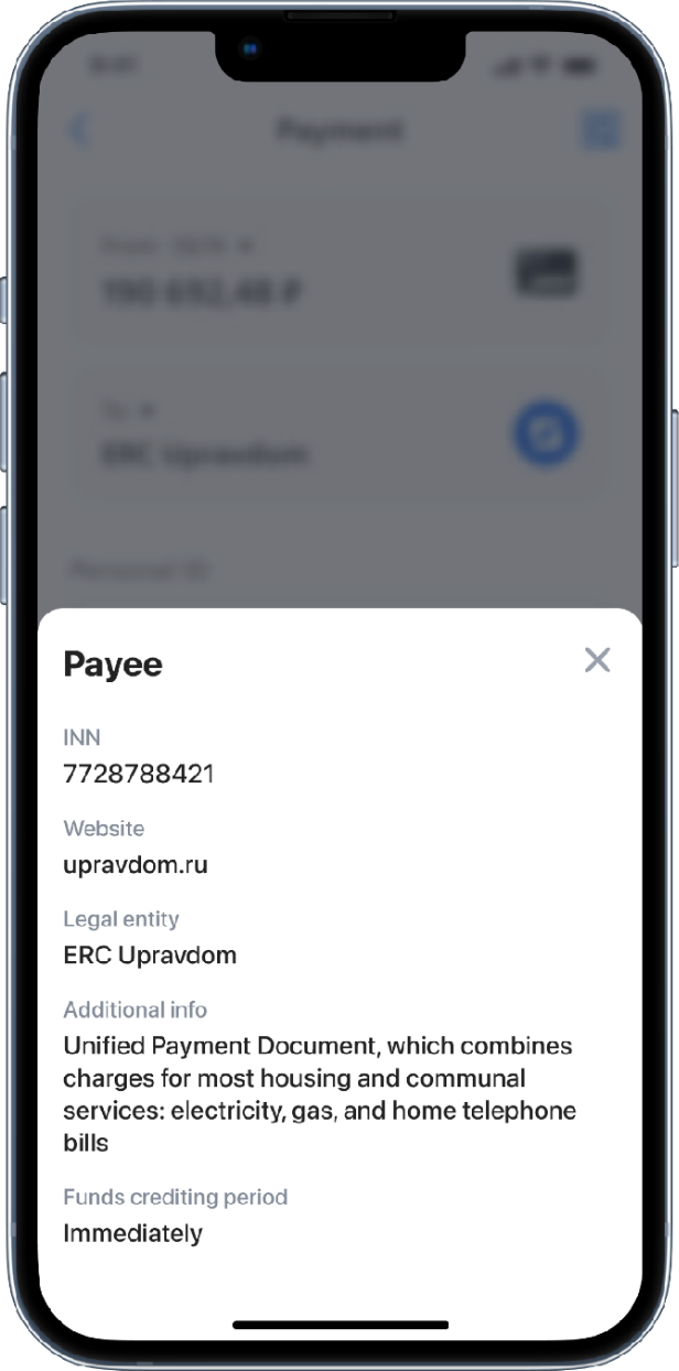
By adding detailed Payee information before making a payment, we made the payment process transparent.

Wizard is a modal screen focused on each field. This allowed us to improve the user experience by adding suggestion and detailed tips without overloading the main form with this things.
The next stage is visibility
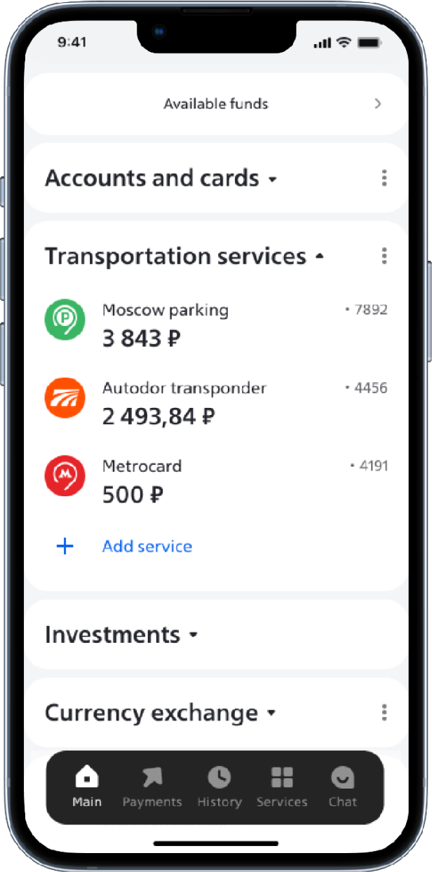
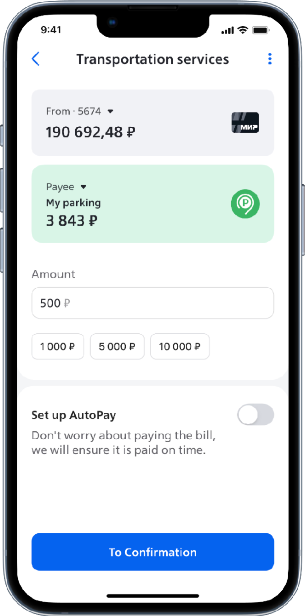
One of the insights was realizing that users want to see their transportation service balances on the main screen. This required integration, but after adding it, the number of payments for these services tripled (×3)
Result
In 2021, the penetration into the active user base for our payment services reached +117%
The consulting agency Markswebb, which annually publishes a ranking of the best banking applications in terms of UX and CX, raised the VTB app from 16th to 4th place for 2021. For 2023, the VTB app reached 1st place
